Your brand colors
Pick the header color and the accent color your designers use, and what the readability warning means.
Your designers use two colors from Settings. They are labeled Header color and Accent color on the page.
Steps
- Open Settings and find Your branding.
- Find Header color. It is the dark bar at the top.
- Click its swatch to pick a color. Or type a code such as #0f6b5c in the box beside it.
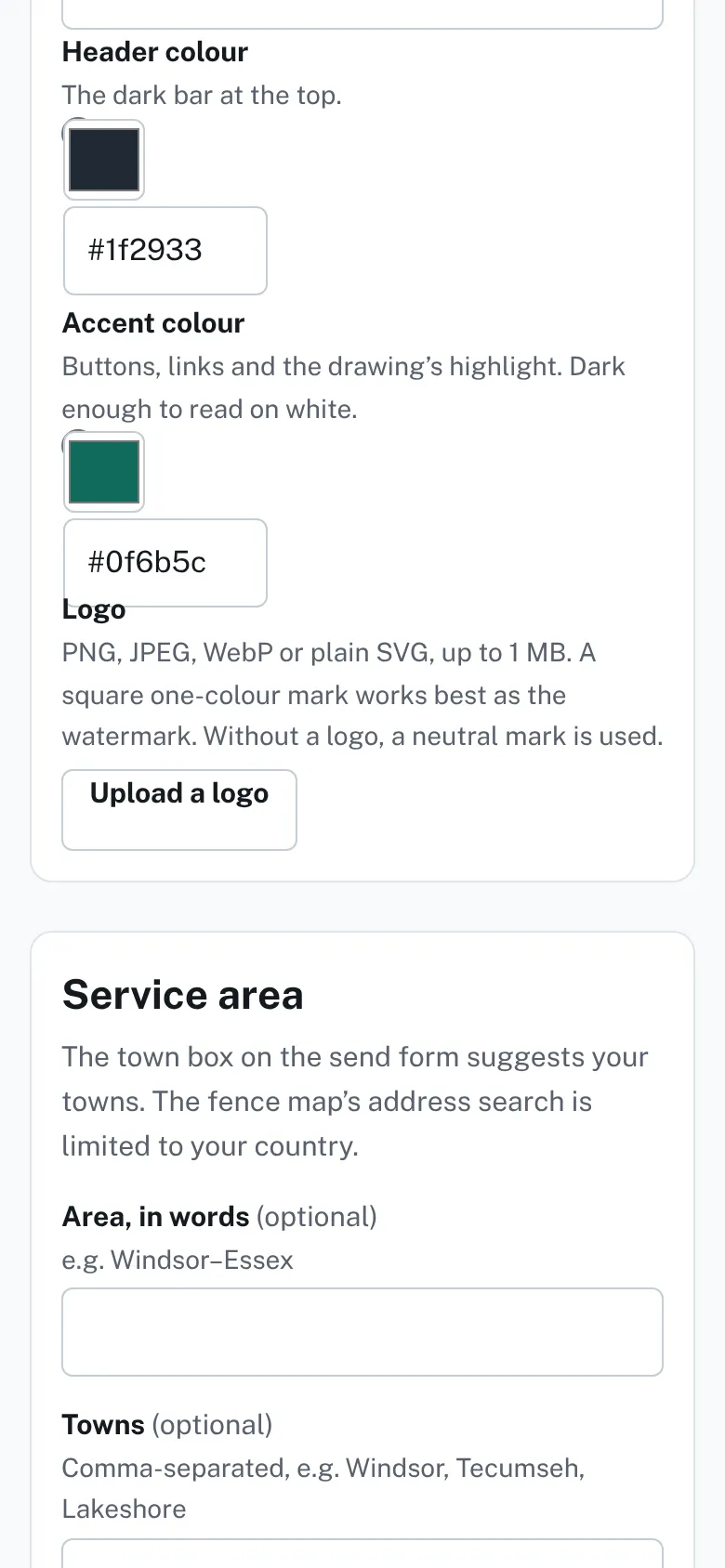
The Header color and Accent color boxes in Settings, each with a color swatch and a six-digit hex code. - Find Accent color. It is for buttons, links and the drawing's highlight.
- Pick it the same way.
- Press Save settings. "Saved." appears next to the button.

Good to know
- Type a color as a hash sign and six letters or digits. Anything else is refused, and the message shows the right form.
- The swatch and the box stay in step: change one and the other follows.
- A color that is too light still saves. A warning then shows under the button.
- A light accent warns that text and buttons will be hard to read on white.
- A light header warns that the white text on it will be hard to read.
- The accent should be dark enough to read on white. A darker shade fixes the warning.
- Nothing changes for homeowners until you save.
- Your name, phone and logo are in Your name, phone, email and logo.
Checked against the product on 2026-11-19.